Card Spend
Management
AI Agent
A B2B fintech bet on AI, before we knew what that meant
Reap is a corporate card and expense management platform serving finance managers and business owners across Asia. Our users don't manage one card. They manage dozens, across teams, with different limits, roles, and policies.
In 2025, the company made an early bet: build an AI agent that replaces the dashboard UI for card operations. The thesis was right. The execution was not. My job was to help fix that.
Four failure modes. No design foundation.
The alpha shipped with engineering ambition but no UX foundation to match it. I diagnosed four distinct failure modes, not from the backend out but from the user's perspective in: what broke trust, what made good design structurally impossible, and what had to change before any interface work could begin.
The trust problem
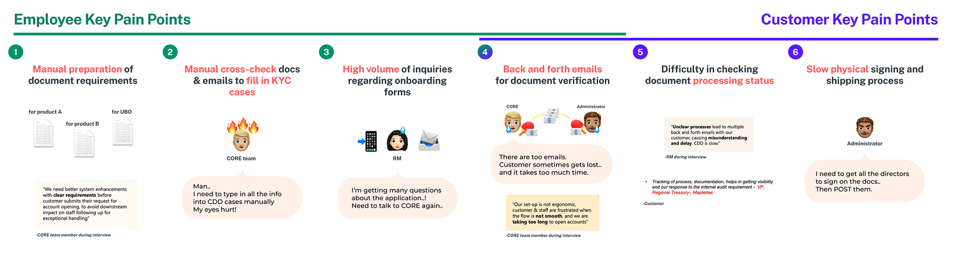
The agent showed "Completed" then immediately displayed an error. Progress indicators were decoupled from reality. No correction mid-flow. Responses appeared all at once after a 47-second wait.
This is not a latency problem. It's an honesty problem. An AI that lies about its own state cannot be trusted with financial actions.
The scope problem
No one had clearly defined what the agent should and shouldn't do. The same agent handling card operations also responded to mental health queries with helpline numbers. Without clear boundaries, there was no safe design surface to work with, and no way to design confidently for any of it. Before interface work could begin, product clarity had to come first.
The interaction model problem
The agent lived in a generic chat drawer. No quick actions. No structured confirmation. No visual card preview. The UX was a blank text box bolted onto a broken backend.
The architecture problem
Streaming responses, honest progress indicators, and instant acknowledgment (core UX requirements) were structurally impossible. A guardrails pipeline ran 3 sequential LLM calls before the agent could start, adding 2.5 seconds of overhead before any response began. Design intent kept colliding with infrastructure constraints.
What I needed to learn before designing
I ran discovery across three parallel tracks: user pain points, technical constraints, and building an AI design framework for the team.
"The ops team couldn't finish basic card creation. Testing was abandoned. The previous agent's 47-second response time is not a baseline. It's a failure mode."Known problems
Deciding what AI should and shouldn't do
Before designing any interface, I established a capability framework with the product team. The question was never "what can AI do?" It was "what should AI do, and how does it know the difference?"
Automation
Do a task end-to-end for the user.
"Create monthly allowance cards for all new joiners in December, both physical and virtual."
Agent handles the full flow. User reviews and confirms.
Acceleration
Help users complete tasks faster by filling gaps intelligently.
"Auto-fill card creation forms based on previous data, category, and company policy."
Agent reduces keystrokes and decision fatigue.
Augmentation
Help users do their job better by surfacing what they'd miss.
"Flag overspending, suspicious transactions, duplicated charges, dormant cards."
Agent acts as a second pair of eyes.
Every UX choice had a reason
The v2 design was built on one principle: the agent earns trust through honesty, speed, and knowing its limits.
Principle: Progressive disclosure
Principle: Honest feedback loops
Principle: Smart defaults with escape hatches
Principle: Human-in-the-loop for irreversible actions
Principle: Transparent capability boundaries
Principle: Forgiving by default
Designing for every moment in the conversation
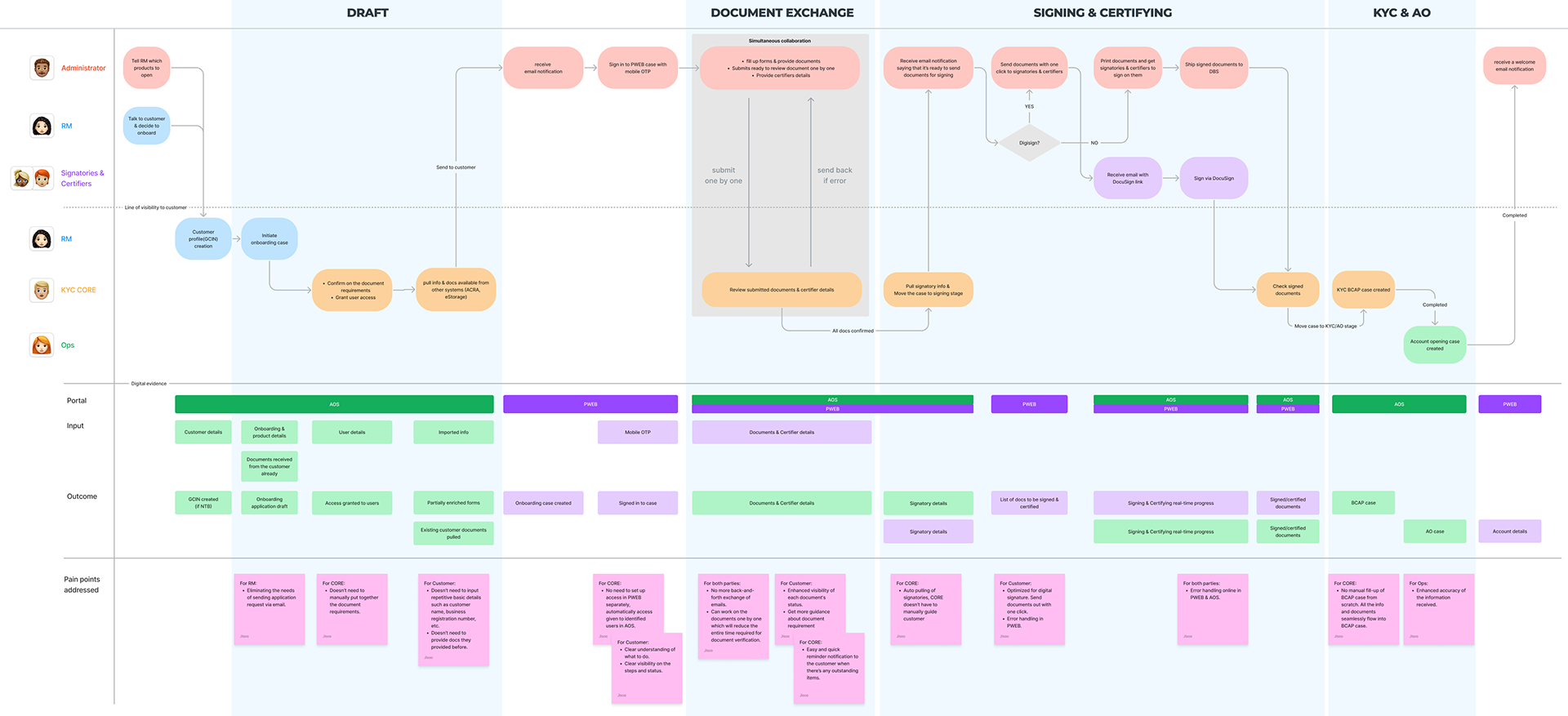
Through close collaboration with an engineer, I defined 8 distinct agent states covering the full lifecycle of a card operation conversation, a concept entirely absent in the alpha.
| State | When it occurs | UX behavior | Design intent |
|---|---|---|---|
| Idle / Empty | Agent ready, no conversation | Quick action chips: Create card, Freeze card, View cards, Summarise spending, role-scoped. | Lower activation energy. No blank cursor. |
| Waiting for input | Agent asked a question | Input field active. Previous question stays visible. No timeout pressure. | Conversation feels like dialogue, not interrogation. |
| Processing | Agent executing an action | Step-by-step progress. Streaming text. Each step is honest about system state. | Transparency over speed illusion. |
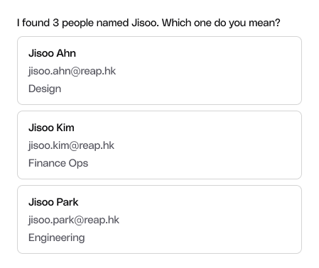
| Disambiguation | Multiple matches found | Agent presents options with distinguishing details: name, email, role, card last 4 digits. | Avoids wrong-person errors in financial contexts. |
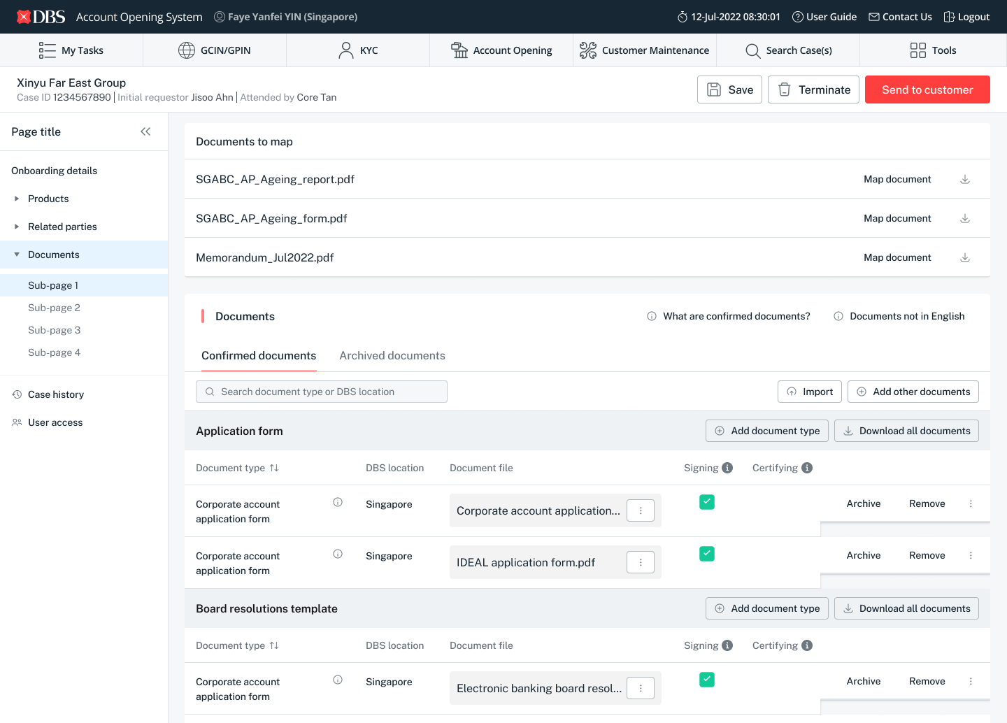
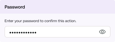
| Confirmation required | High-impact or destructive action | Full card preview. Explicit confirm required. Card termination: additional password re-entry. | Human authority over AI execution. |
| Action complete | Action succeeded | Clear success message with result details. Never followed by an error. | Closure without ambiguity. |
| Error | Action failed | Plain-language explanation. Actionable next step. | Honesty over appearance of competence. |
| Out of scope | User asked something the agent can't do | Agent names its scope, says what it can't do, offers within-scope alternatives. | Bounded capability is a feature, not a bug. |
Design decisions informed by architecture
I worked closely with the AI engineer rebuilding the agent from scratch. Understanding the technical constraints wasn't optional, it was the only way to design responsibly.
What I learned from the engineering docs
The alpha's NeMo Guardrails added 1.5–3.5 seconds of overhead before the agent even started: three sequential LLM calls.
Understanding this taught me that UX requirements like streaming and instant acknowledgment were architectural asks, not just design preferences. I had to advocate for them with engineering context, not just user empathy.
Where I pushed back on product
The initial PRD said "conversation context should not be preserved" on error. I challenged this. If a user is mid-flow and hits a technical failure, losing context forces a full restart. We revised to: preserve context, surface the specific failure, let the user retry.
I also raised the audit trail question for destructive actions, making the case that the UX needed to surface this, not just log it in the backend.
Design principle: In agentic systems, UX requirements and architecture are inseparable. You cannot design honest progress indicators if the backend doesn't stream. You cannot design safe confirmation flows if the agent has direct write access. I treated the engineering architecture as a design constraint, and as a lever.
Finding the right interaction model
Before committing to a direction, we explored how Reap AI should surface within the product. The question wasn't just what AI could do, but where and how it should appear. We evaluated 4 desktop interaction models and 2 mobile entry points against three criteria: discoverability, content visibility, and suitability across task complexity.
Design principle: AI chat is not always the answer. The right interface depends on whether the user knows what they want, needs to be told something, or needs guided action. This became the decision filter for every UX choice in v2.
Rule of thumb I defined for the team
- If the user knows what they want → inline / structured UI
- If they don't know what they want → conversational
- If they need to be told something → insight surface
- If they need guided action → copilot / workflow assistant
For card operations, users know what they want. We chose a conversational copilot with structured confirmation moments, not a pure chat interface.
Why we ruled out alternatives
- Pure chat: Context drift, hard to verify, no confirmation structure
- Hidden workflow automation: Dangerous for financial actions, where surprise is a bug
- Insight-only surface: Doesn't address the core task completion need
Baseline: transactions page, AI trigger in nav
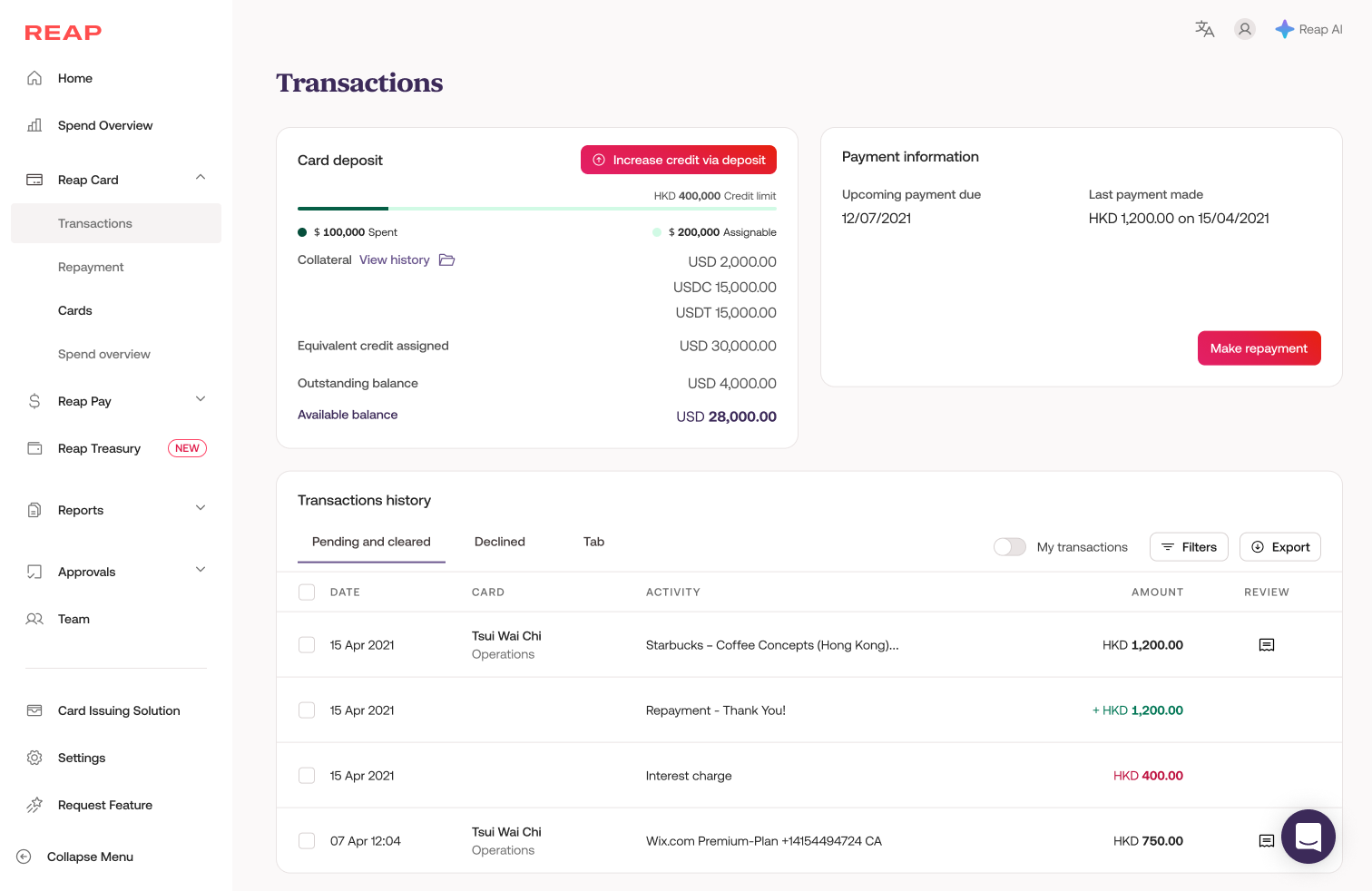
Desktop: 4 interaction models
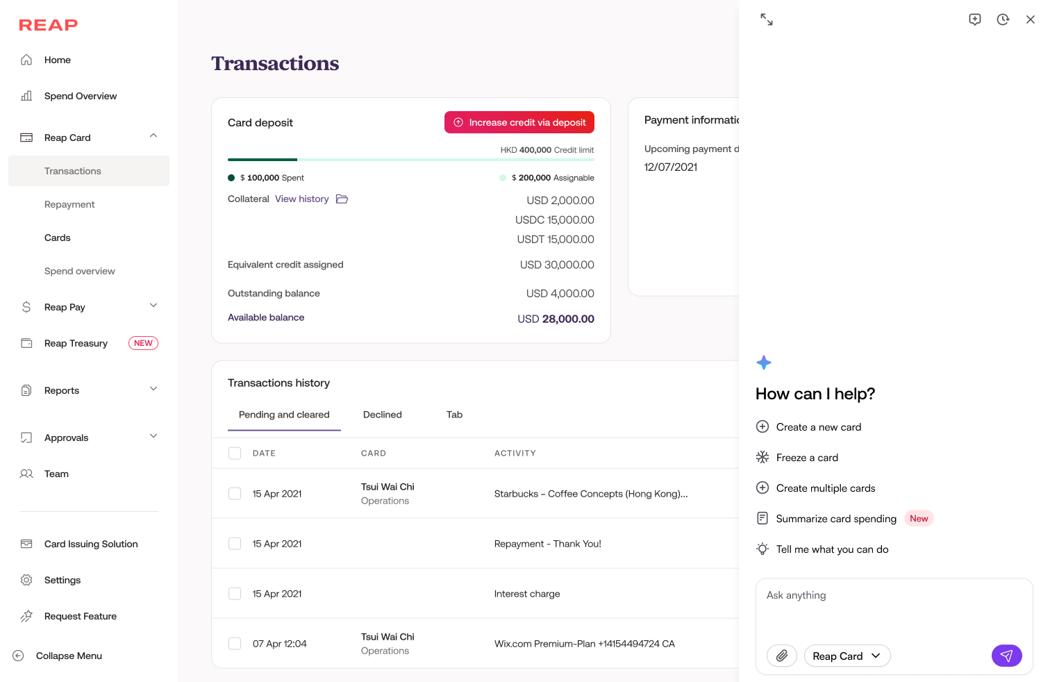
Drawer: content covering
The AI drawer slides in from the right and overlays the main content. Users keep access to AI capabilities but lose partial visibility of the page behind.
Pros
- Dedicated space for the AI, with more room for output and interaction
- Can surface contextual help relevant to the current page
Cons
- Entry point can be hard to find before the drawer opens
- Content behind is obscured, which can feel cluttered for data-heavy pages
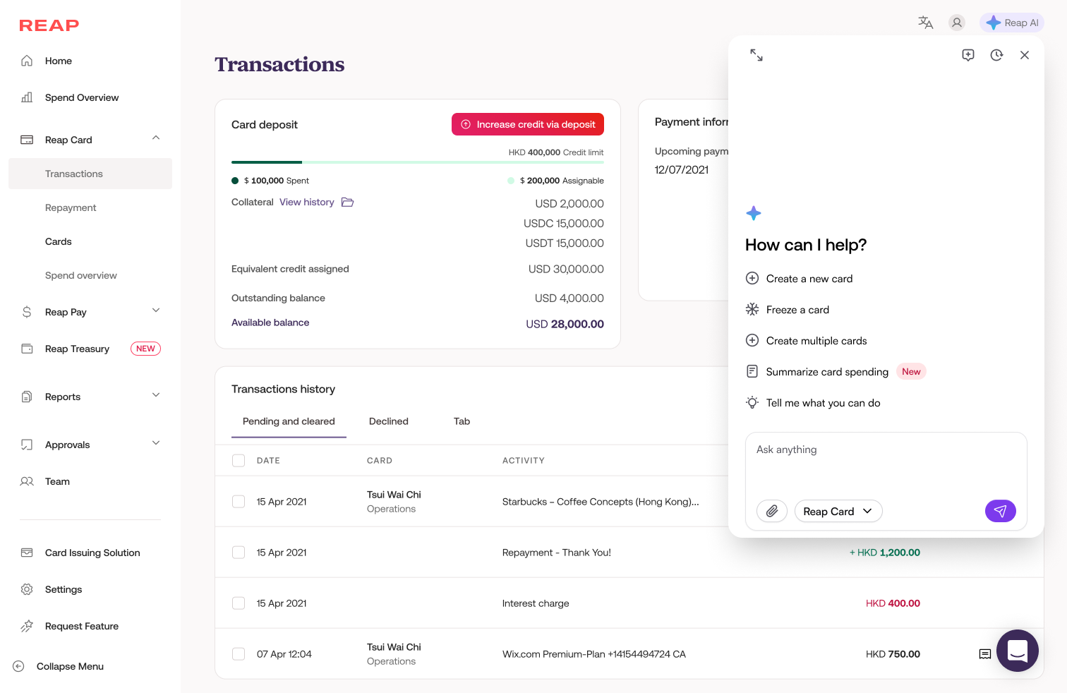
Floating island
A compact floating card anchored near the content. Designed for quick, discrete actions, expandable to a drawer or full screen when the task demands more space.
Pros
- Full page stays intact, with no shrinking or covering
- Ideal for quick discrete actions: freeze a card, check a balance, pull card details
Cons
- Not suited for complex multi-step guided flows (bulk card setup, analytics review)
- Requires dynamic sizing or escalation to drawer/full screen for heavier tasks
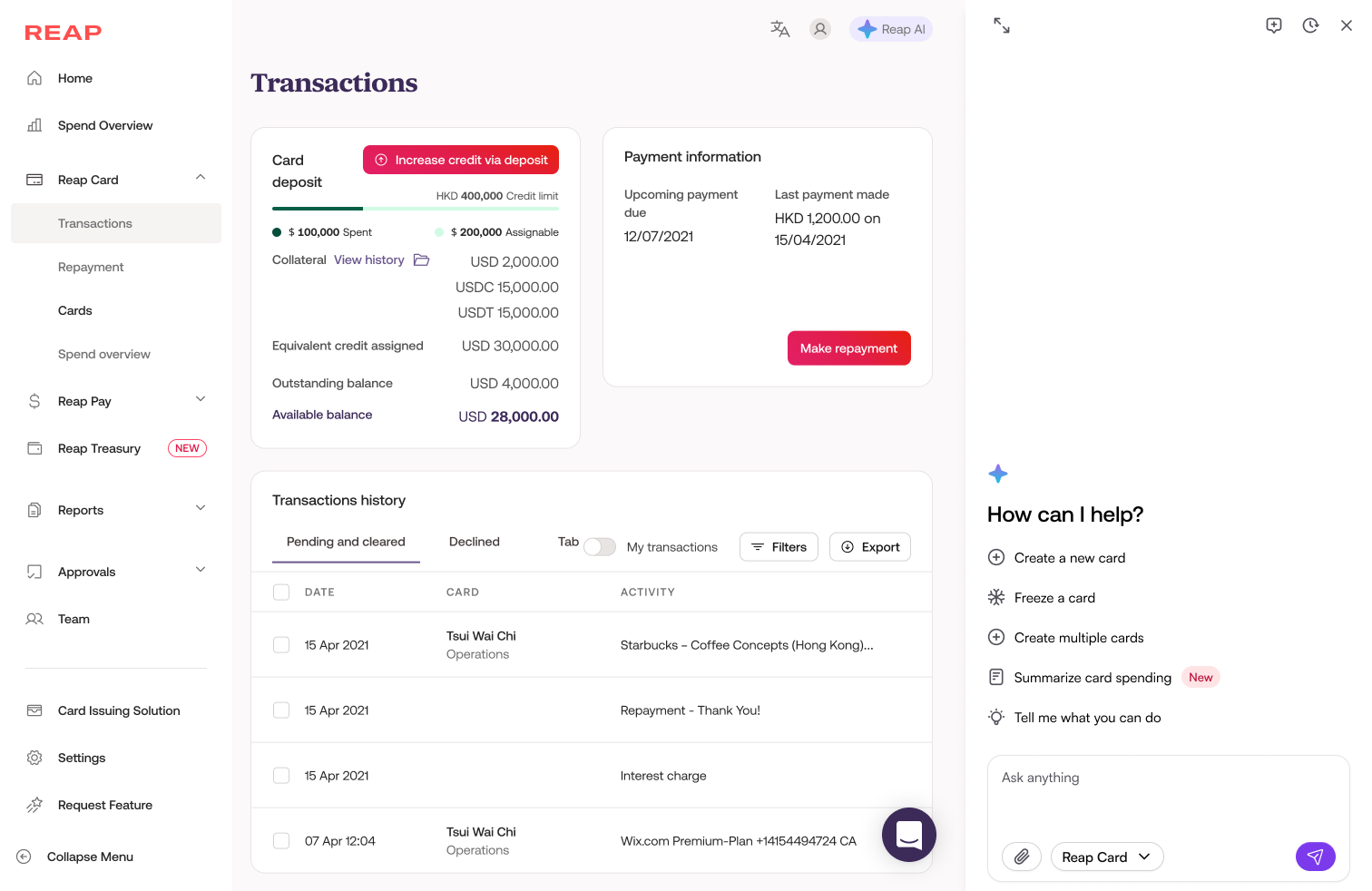
Drawer: content pushed
The main content area compresses to make room for the AI drawer. The page stays visible but narrower, a cleaner compromise than full overlay.
Pros
- Page content stays in view, so nothing is hidden
- Cleaner and less disruptive than the covering variant
Cons
- Content area becomes too narrow especially for items that need more space (bulk card creation, analytics, table data)
- As-is responsiveness was not comprehensive, which could lead to broken or visually messy layouts across different screen sizes.
Chat-first (dedicated page)
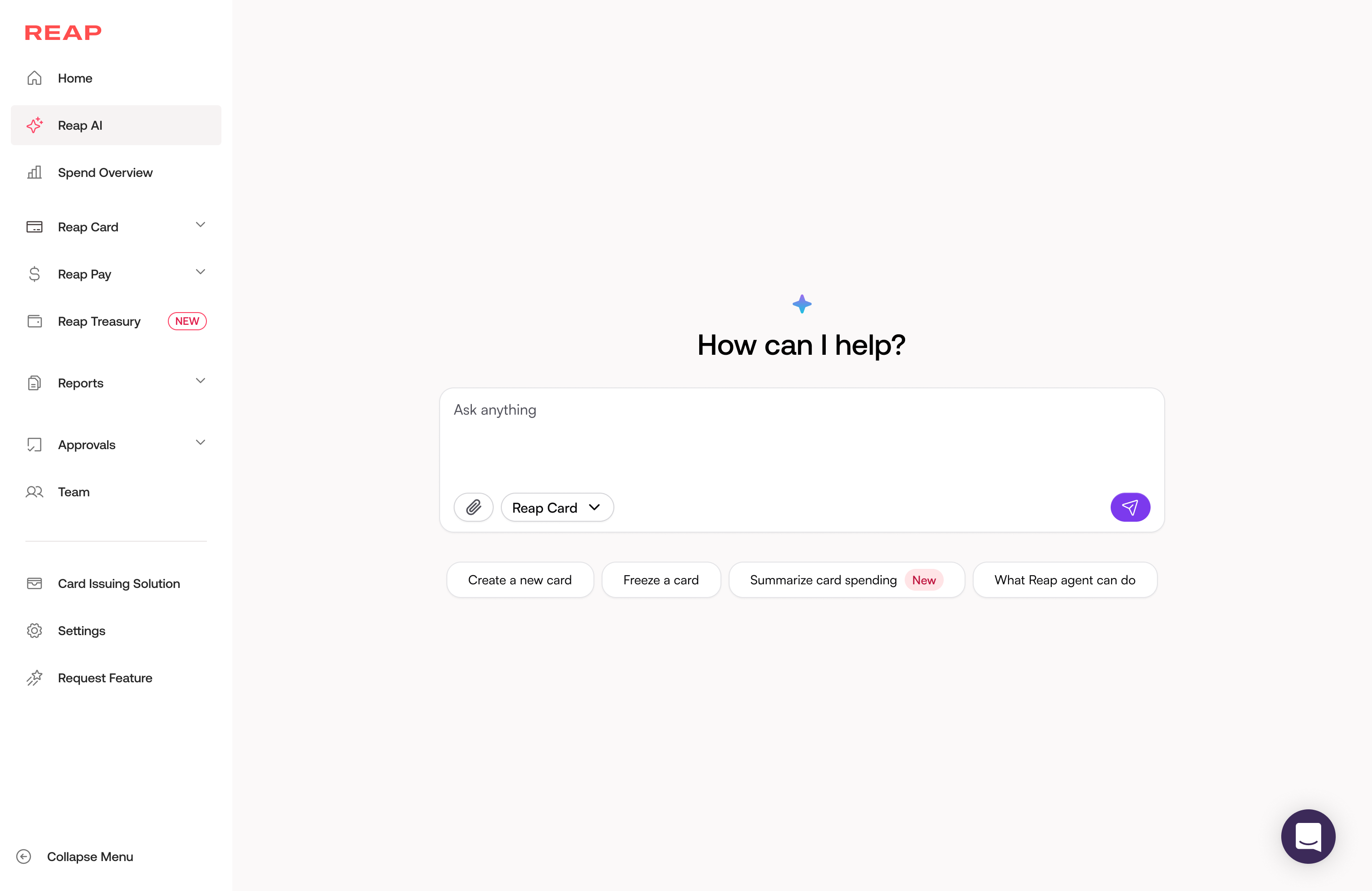
Reap AI lives as a top-level navigation item. Users navigate to a dedicated AI chat interface. The entire page becomes the AI surface.
Pros
- Plenty of space for both input and AI output
- Good for exploratory use, when users don't know what to do and want to discover capabilities
Cons
- Users have left the page they were working on, so context is hard to provide
- Can't reference underlying content (transactions, card list) while chatting
- Better suited for a future state where AI capabilities are more standalone and comprehensive
Embedded guidance / Contextual copilot
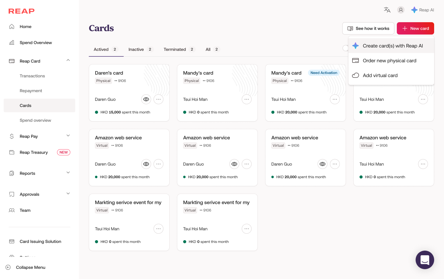
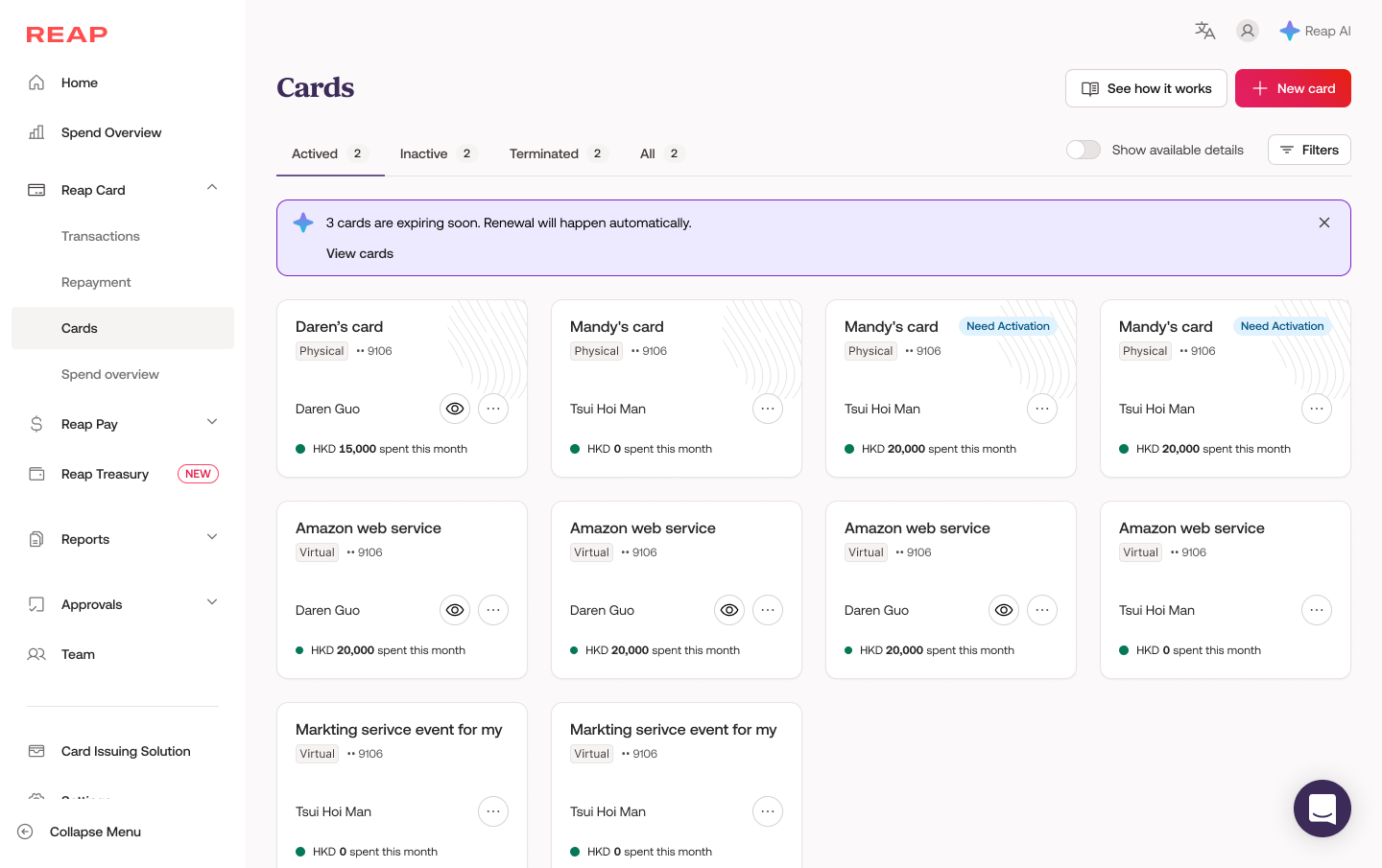
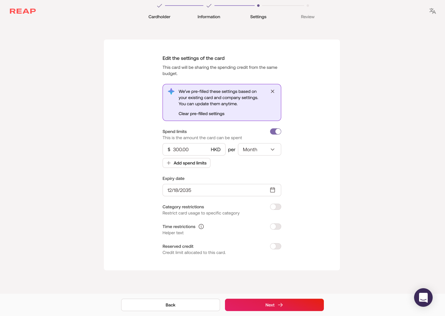
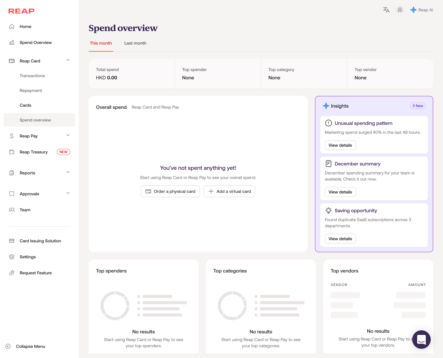
AI is woven directly into the interface. Rather than a separate AI surface, the system surfaces proactive nudges, inline suggestions, pre-filled settings, and insights contextually as users work, at the moment they're most relevant.
Pros
- Most natural and findable, since AI surfaces where users already are
- No mode-switching or extra navigation; potentially the most efficient model
- Strong alignment with how power users actually work
- Best for users who want control but benefit from a little help
Cons
- Can feel intrusive if triggered too aggressively or designed poorly
- Requires deep understanding of user context and use cases to get right
- Higher design and engineering complexity
Examples explored: Card expiry warning banner with auto-renewal suggestion · Spend Overview "Insights" panel surfacing unusual patterns and savings opportunities · Card settings form with AI-pre-filled spend limits based on usage patterns.
From abandoned alpha to production-ready v2
The v2 design transformed an abandoned prototype into a production-ready agent that the team is confident shipping to clients.
Core operation coverage
V2 scope was prioritized around card management first, the core operations users simply cannot do without. Create virtual card, freeze, unfreeze, terminate, update spend limit, view cards, summarise spending, each with full state coverage and edge cases.
No state left undefined
Idle, processing, disambiguation, confirmation, success, error, out-of-scope, session timeout. Every moment is designed, not defaulted.
Design as product spec
Including: multiple cardholders with same name, wrong category inference, mid-flow cardholder switch, permission boundary handling: all scenarios that break generic AI chat.
Framework for AI design at Reap
The AI capability framework and interaction model principles I established became the team's reference for evaluating all future AI features, not just this agent.
Role-aware default state
The idle state isn't a blank cursor. It's the agent's first impression and a trust signal.
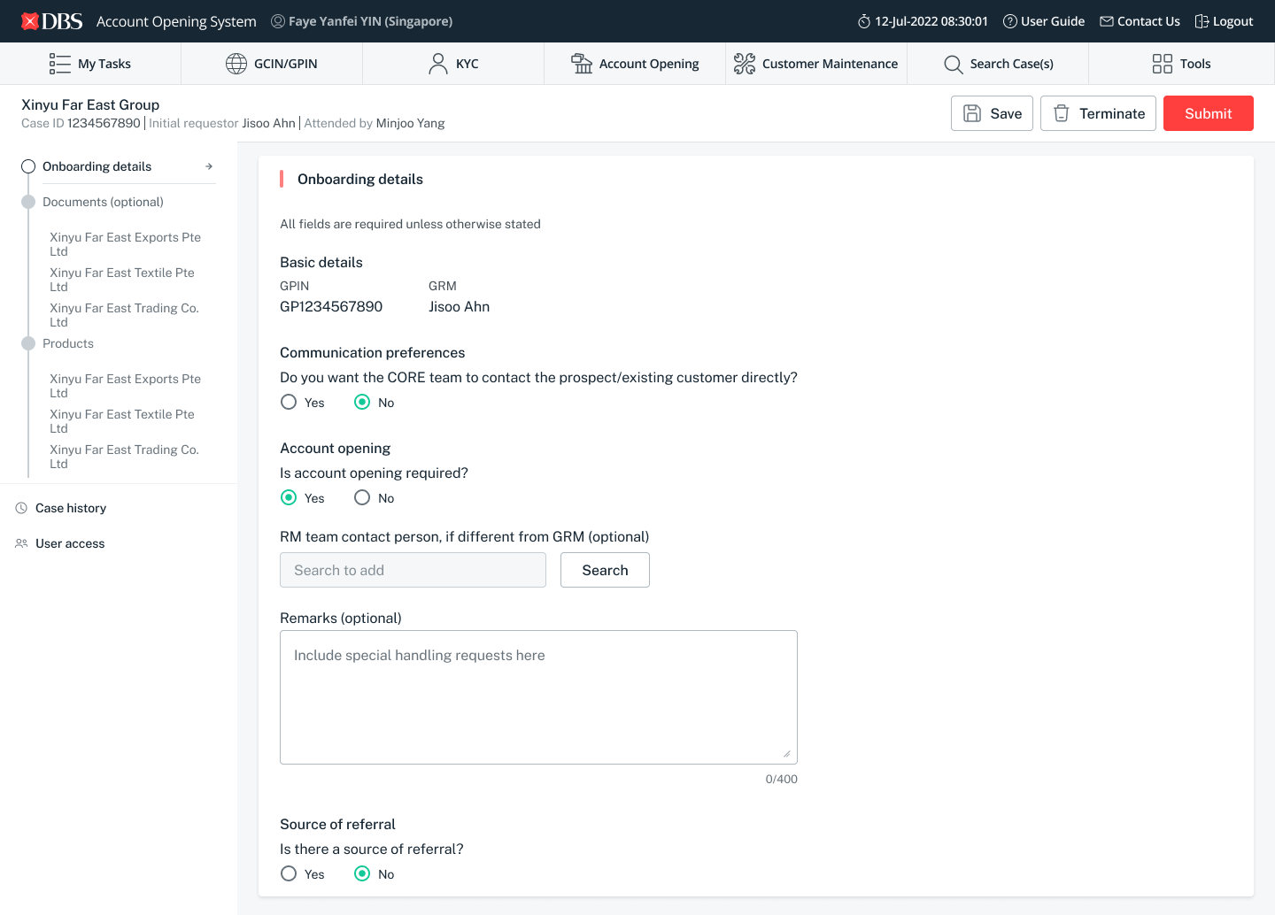
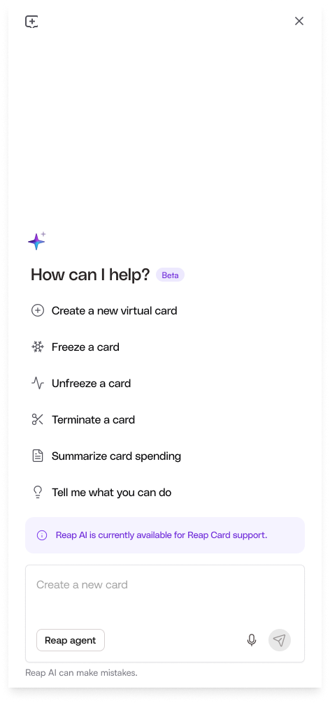
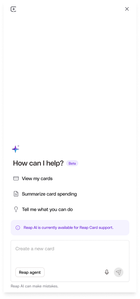
I designed two distinct default states based on user role. Group owners, admins, and owners see the full action set: create, freeze, unfreeze, terminate, summarise spending. Individual team members see a scoped-down view, only what they're permitted to do. Quick-action chips map directly to the agent's actual capabilities, so users know what to ask before they type anything.
Three transparency signals were deliberately built into the idle state:
- "Beta" sets honest expectations about maturity
- "Reap AI is currently available for Reap Card support" communicates scope before the user hits an out-of-scope wall
- "Reap AI can make mistakes" maintains honesty without undermining confidence
- "Tell me what you can do" is a low-friction entry point for users who aren't sure where to start
Defined loading states
Loading states aren't a technical detail. In an AI agent, they're a trust mechanism.
Text output
I worked with engineering to confirm that response times would be short enough that a simple "Working on it…" message with a shimmer effect would be sufficient. Streaming wasn't necessary and would have added implementation overhead for minimal UX gain.
Widget-based workflows
For card creation and spend summaries, we made a different call. These operations are multi-step and take longer. The agent streams its activity in real time: the "Agent activity" label appears first with a shimmer, then expands step by step, with each item showing its own loading state. Users can see exactly where the agent is, not just that something is happening but what.
Design principle: This distinction between text and widget loading wasn't a UI decision. It was a product decision made with engineering, grounded in latency data and user trust.
Overflow and scroll behaviour
Most chat interfaces scroll blindly. I designed the overflow behaviour around where the eye actually lands.
Space to breathe
The chat window always leaves some breathing room below each message. This creates a consistent visual anchor point, so your eyes naturally rest in the upper-middle zone while reading each response, reducing the sense of content rushing to the bottom of the screen.
For longer responses
Responses that exceed the chat window height anchor to the top so users can start reading from the beginning immediately. An overflow button sits fixed at the bottom, giving users a deliberate, one-tap way to jump to the end when they're ready. Reading first, scrolling by choice.
Reusable agent output patterns
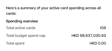
I can't predict every user input. So instead of designing for individual messages, I designed a system of generic, reusable output patterns that engineering can apply consistently across any response type.
Defining these patterns meant that no matter what a user types, the agent's output stays consistent, scannable, and on-brand. It also gave engineering a clear contract with fewer edge cases and fewer one-off implementations.
Simple text
Plain conversational responses with no UI chrome
Single selection list
When the agent needs to confirm one specific choice, such as which cardholder
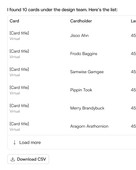
List
Multiple results or options presented with structure
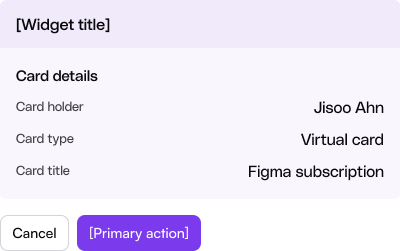
Widget
Structured card previews for confirmation, creation, and summary flows
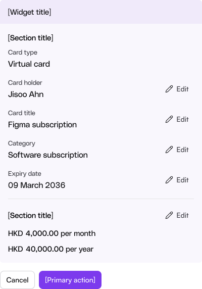
Fallback scenarios with copy and UI pattern guidance
An agent that only works on the happy path isn't production-ready.
I defined four fallback scenarios, each with a design purpose, copy anatomy, and UI pattern:
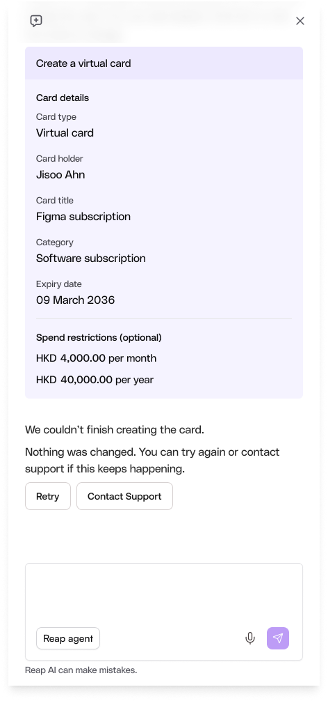
Execution failure
When something goes wrong technically: an API failure, network error, or server issue. Copy acknowledges the attempted action, confirms nothing was changed, and offers a clear next step: Retry or Contact Support. Users should never wonder if their financial data was affected.
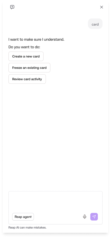
Confidence below threshold
When the agent's confidence drops below 51%, it doesn't guess. It presents 2–4 closest-matching options as buttons, not text links, so users can select intent without retyping. This narrows the conversation without stopping it.
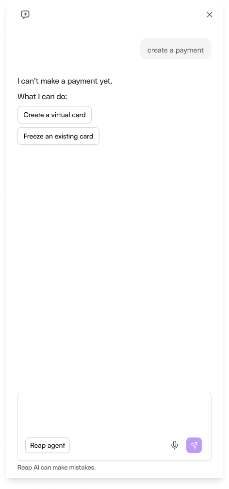
Understood but out of scope
When a request is understood but outside scope. The agent doesn't apologize or explain technical limitations. It states the boundary neutrally, then immediately pivots to what it can do. Every out-of-scope response ends with an alternative, never a dead end.
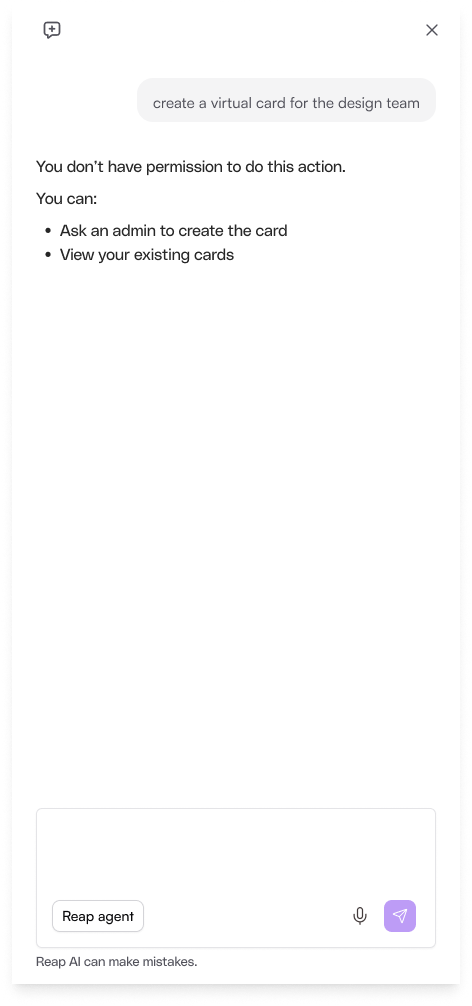
Restricted action
When a user without sufficient permissions attempts a restricted action. The agent names the limitation clearly and offers escalation paths (asking an admin or viewing their own cards) without blame or friction.
What I'd tell a designer starting an agentic product
Start with trust, not features
An AI agent that lies about its own state is more damaging than one that's simply slow.
Scope is a design deliverable
In agentic products, what the system won't do is as important as what it will. Designing the out-of-scope state required drawing the line, and getting cross-functional alignment on it.
Architecture and UX are the same problem
I couldn't have designed honest progress indicators without understanding why the alpha's streaming was blocked. The most impactful decisions also changed engineering priorities.
UI styling was de-prioritised for this feature. With limited resources, the priority was enabling the capability first. To keep the experience consistent with the rest of the product, I relied on the foundational layer of the existing design system and pulled in reusable components from the web design system wherever possible.